Google Classroom 2.0
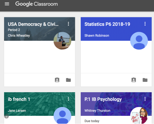
Google Classroom homepage, highlighting their new updates, features, and refreshed visual representation.
Google Classroom is a free web service that provides an easy way for learners and teachers to connect — inside and outside of school. Since Classroom’s initial launch in 2014, Aspen High School has been utilizing this suite of productivity tools in order to improve time management, class organization, and teacher-student communication.
On August 7th of this year, Google introduced a major redesign of Classroom that includes an updated look and a variety of new features. Some of these new features include a new grading tool that works with all file types, and a “comment bank” where teachers can reuse frequently used feedback to prevent students from making the same mistake. Google said that this is “meant to encourage thoughtful engagement.”
Although the people at Google believe that these features are more efficient and beneficial, the redesign has induced a variety of mixed emotions among the users at Aspen High School.
AHS Technology Integrator Evan Obranovic feels as though the update is significantly more favorable for educators and students. Obranovic explained some of the new features and their functions.
“I think the new design is very user-friendly because of how it integrates with everything we’re doing in class, and how simple it seems for teachers and their proficiency. From the teacher perspectives, I think they like the new design and find it more useful because everything is now broken up into more classified sections. They divided ‘classwork’ and ‘stream,’ enabling teachers to organize assignments by category which keeps it cleaner than the old version,” Obranovic said.
Freshman Seminar teacher and frequent user of Google Classroom Karen Zohar had difficulties adjusting to the new design, but ultimately prefers the update in the realm of organization.
“There was definitely an adjustment period because we’re so used to the old way, but I think it will be a much better way to do things academically. I like how it separates classwork that needs to be graded from ‘announcements,’ while managing to keep everything in one place… it’s designed very well,” Zohar said.
Mathematics teacher Josh Anderson did not observe significant changes with the update, and also experienced difficulties with particular functions. Regardless, he believes that it will prove to be favorable to the community.
“I don’t think its very different, just very minor changes. The one thing that was annoying was that I couldn’t put information in the ‘about’ section of my Classroom, but they kind-of fixed that. I think that once we adjust, the new design will be better for everyone. If I could give Classroom feedback, it’d just be to better integrate other websites like Khan Academy, so you can still see those assignments in Classroom,” Anderson said.
Despite these positive observations from the teachers, the students seem to possess alternate opinions regarding their experiences with the update thus far.
Junior Juliana Nickel discussed the obstacles she endured with Classroom, explicitly regarding her inability to view various documents.
“It doesn’t make sense at all, and everything is confusing. I can never view certain folders, and it’s difficult when students can’t find the materials or powerpoints that we need to do our homework. I wish it would go back to the way it used to be,” Nickel said.
Similarly, senior Noah Hollander noticed the new design’s complications resulting in a severe impediment to his academic success.
“The new design honestly sucks… like for biology, I now have to go to this weird place in Classroom to get class notes. I always forget that the notes are here because they aren’t on the main page, so I forget to study for a test and get a bad grade. I’m happy to have a working platform for school stuff, but it’s not as user-friendly and simple as it used to be,” Hollander said.
In contrast to the negative attributes that students encountered, there also seemed to be positive student responses to the update’s applicable functions and efficient time-management.
Senior Jack Hughes appreciated Classroom’s refreshed visual representation, and it’s enhancement of teacher/student connections.
“I love the way that the new Google Classroom looks: vibrant. It’s way more organized than before, and more efficient, especially with my classes. It also has helped teachers with planning their classes; they all seem more organized. It’s way more interactive, and that’s awesome,” Hughes said.
Freshman Charlie Williams, using Google Classroom for the first time at AHS, likewise values the web service, regardless of these changes.
“I like the new design a lot, and I don’t think there are many changes. I love Google Classrooms no matter the design because students find it very helpful to keep classwork more organized and easy to find,” said Williams.
Senior Tyler Greene conveys her struggles with this adjustment period, and how it has affected not only herself, but the entire community.
“I think the teachers are also confused on how to use it as well as the students. For example, one of my teachers can’t even figure out how to upload the class Powerpoints, so we can’t access them which makes it challenging to do our work. I wish Google would launch a platform where people can learn how to use the new software instead of just changing it all the sudden, confusing everyone, and hindering our academic success.”
On the other hand, junior Bella Williams shared a completely alternate perspective.
“I didn’t even know there was a new design,” she said.
No matter how large the scale, any subtle difference is bound to create a period of adjustment time to the users of Google Classroom.

